BARCELONA PAVILION
Is this the most beautiful building ever?
Why we recognise our survival in the Barcelona Pavilion.
The Modern Movement, beginning in the early 1900’s and inspired by the new machine age, developed an aesthetic which stripped away unnecessary ornament from the interior.
As mass production became normalised, the theorists of the movement translated this into the design detailing of their aesthetic choices; the concepts of rationalisation and standardisation meant that it was a natural progression for them to look to create lighter, more efficient and more functional environments.
I have always had the Barcelona Pavilion in my mind as a designer. It is always on my mental aesthetic inspiration mood board. When I was designing for the Royal family in Abu Dhabi, one of my clients was a modernist at heart too, and I was able to finally use the luxurious materials in a simple way for him in his homes. (Ask me about this if you want to hear more).
You see the Barcelona Pavilion, (it’s correct name is The German National Pavilion for the Barcelona International Exhibition, 1929) was built with an unrestricted budget and did not need to function as anything but itself. How glorious.
I will let you read about the history and the rebuilding yourself as what I want to discuss here is;
Why have I always thought this aesthetic expression so strikingly beautiful? It is only in recent years that I have formulated a theory.
I believe it is because it speaks to us at a deep human existence level.
There are layers of fundamental meanings that find a high expression in their manifestation here.
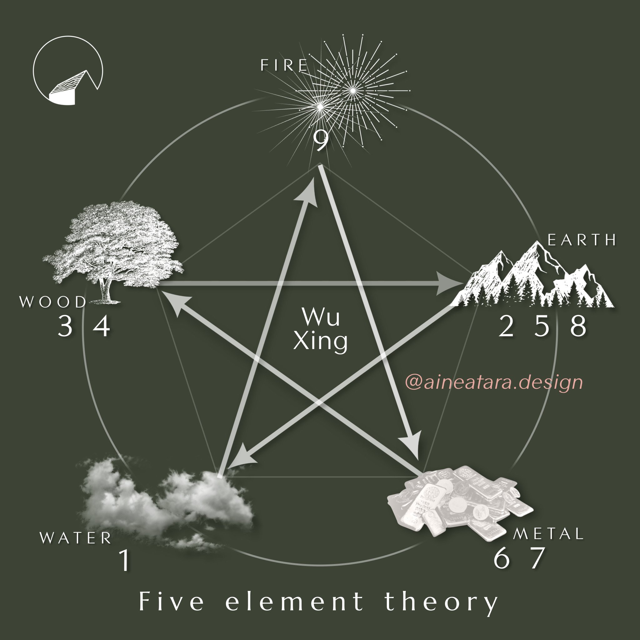
The materials used are those that we have understand since ancient times to be in harmony; water feeds wood, wood and vegetation is turned into stone under intense heat, (limestone, travertine, petrified wood), wood also feeds fire, fire gives us ash and earth materials, we mine metals from the earth and minerals are in our water… the cycle is a movement and process we feel as deeply as solid and true.
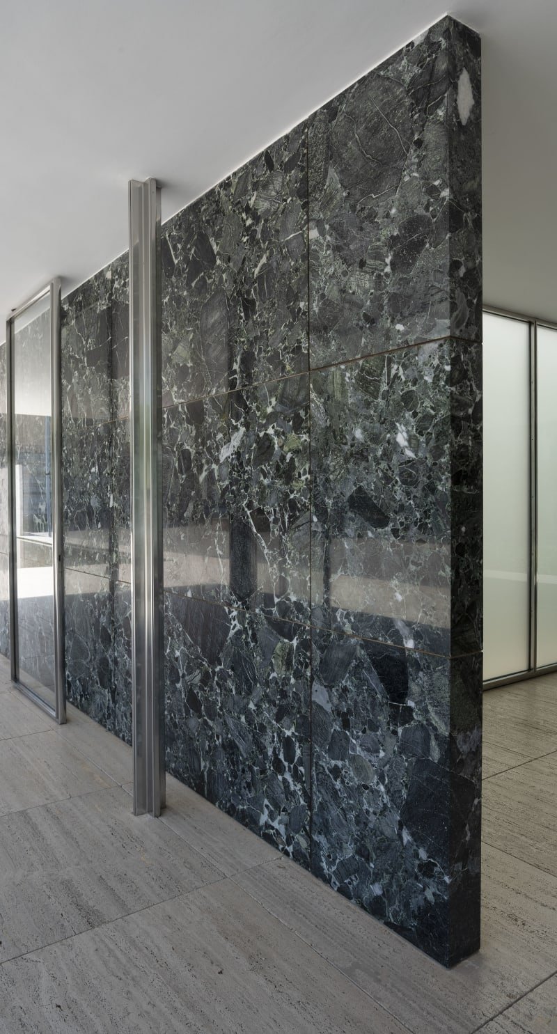
Earth – marble, stone, onyx, travertine
Metal – structural cruciform columns in polished stainless steel
The cruciform relates to the four cardinal directions, north, south, east and west. We needed to understand the quotidian flow and movement of the sun (as we perceived it was moving, not us) and the change of seasons. Crucial for our nutritional survival.
Water – reflecting pool
Wood – the trees on the site but also in the green colour and movement within the marble.
The building has interiority in the courtyard, it feels safe and open simultaneously. It has an interior flowing to the exterior, expressing luxury and abundant clean air.
The sculptural form which is reflected in the pool, has simplicity and elegance.
The patterns are made by nature, there are no carvings, no extra decoration needed. A love of nature expressed without fanfare. There are patterns made by filtered daylight.
It also has the mirror symmetry we so love.
Humans find mirror and ‘butterfly’ or ‘book’ matching pleasing. Is this because we find pair bonding key to our survival? And ‘diamond’ matching is a natural expression of bonding, having children? maybe? oxytocin is released when we experience bonding.
There is freedom here too, expressed in the floating slabs for the roof.
Is there another building more sublime?
This post was first published on Substack. To subscribe to that newsletter please go here
note; Photography by Cemal Emden. view more of Cemal Emden’s photos here


